‘Daily Muslim’ Design Sprint
Being a Muslim is a constant balancing act — juggling our day-to-day routine while also praying 5 daily prayers on time, ideally reading the Quran at some point in the day and saying duas (short prayers) throughout the day. As a busy mum to 2 kids, a full-time UX designer, and someone running my Islamic site on the side, I have always thought there has to be a better way to manage my day.
I would often imagine an app like that combined Islamic practices with productivity tools — every time I opened my prayer times app and wondered why the UI was so dated, or when I missed waking up for Fajr (early morning) prayer and would wish my Islamic app had a more efficient way to remind me.
When I started this app’s design, my aim was to ultimately make an app that all Muslims would find useful in one way or another — whether they use it to build daily better habits, find out about Islam or just get alerted to prayer times. I took a UX approach to designing this app, and you can follow my design process below.
The Challenge
Designing for Muslims is a layered task:
- There are 1.8 billion Muslims in the world. Granted, they don’t all use smartphones, but you realise how many different backgrounds, mindsets, and levels of tech-savviness you’re dealing with.
- Religion is a sensitive subject. People can get defensive about their beliefs, argumentative about details (do you follow Hanafi or Shaafi?), and one wrong word can discredit someone as a religious authority forever.
- Languages — one app would need to be in at least 5 languages to reach a large portion of Muslims who use smartphones.
Using the Design Thinking Process
Before you dig in, if you’re not familiar with UX design, let’s take a minute to see the process.
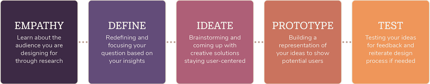
Step 1: Empathy
Understanding the user through research so I can better empathize with who I’m designing for.
Since I’m a Muslim, I could easily think “I know what users are looking for.” Although I thought of this app for a while based on what I would to use as a Muslim, that doesn’t mean I could just dive in and start designing the app. I need to see who I was designing for, what other apps are on the market that my users would frequently use, and why.
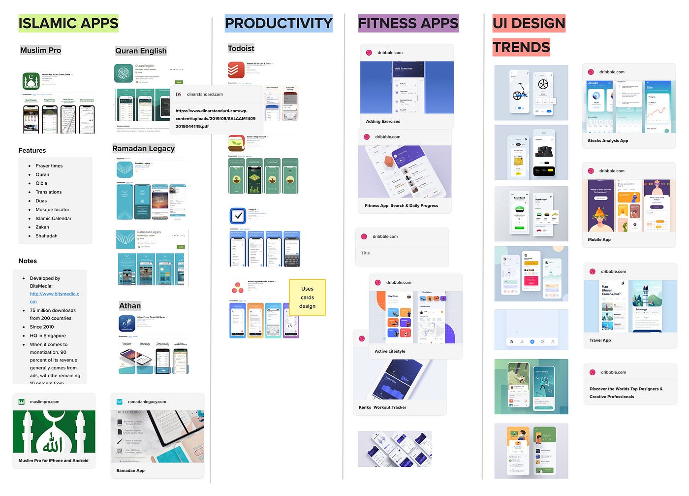
Comparative Research
The ultimate aim for this app was to be a productivity app for Muslims — so I looked at popular Muslim apps, fitness/wellness apps for UI inspiration, and top Productivity apps to see what makes them effective. I also looked at UI design trends for apps for 2019.
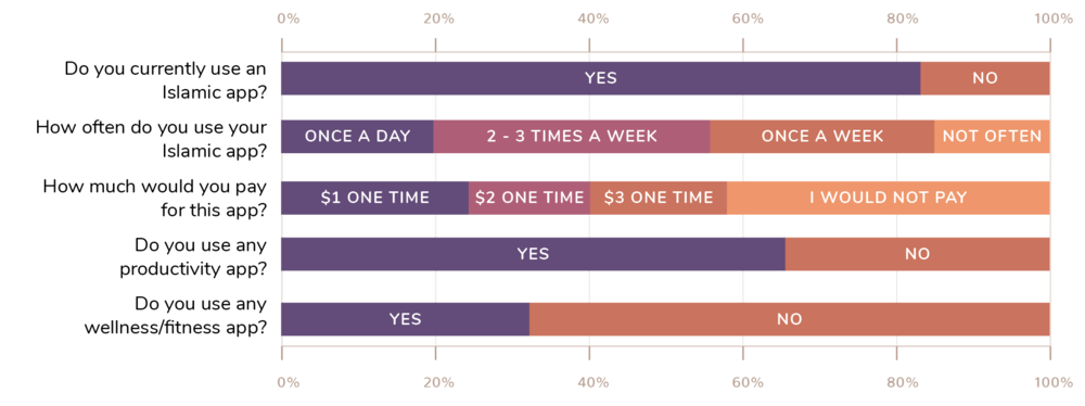
User Surveys
I put up a survey on my website using Typeform to get some insights into people who visit my website, and how they would feel about an Islamic app and their current habits. A total of 62 responses were recorded at the time, which is a decent sample size, and below are some of my findings:
Step 2: Define
Once I had gathered a lot of information about the users, their needs, and problems in the empathising stage, I had to analyse and synthesise it to identify the (real) problem to be solved.
Mindsets
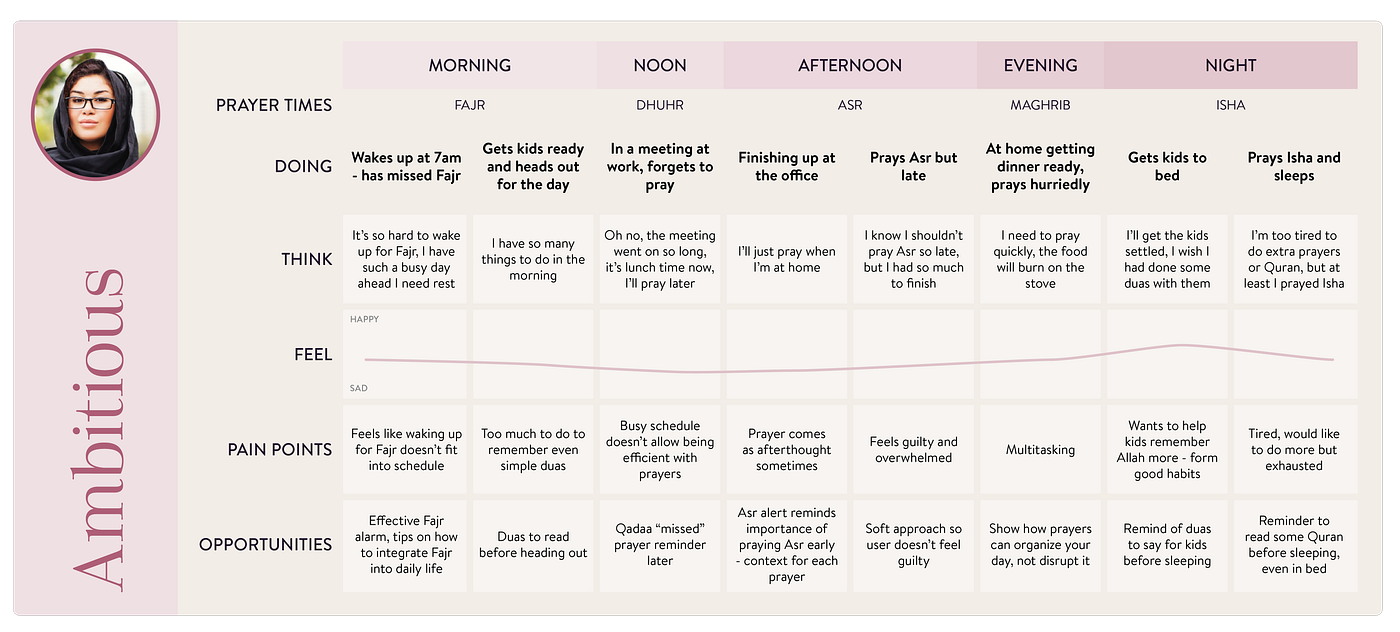
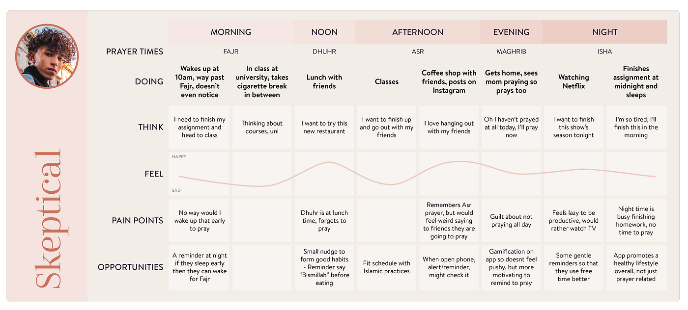
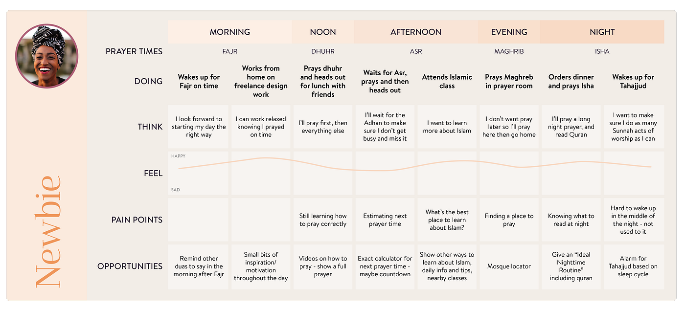
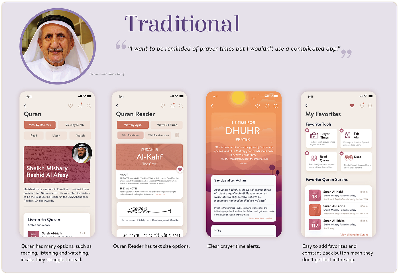
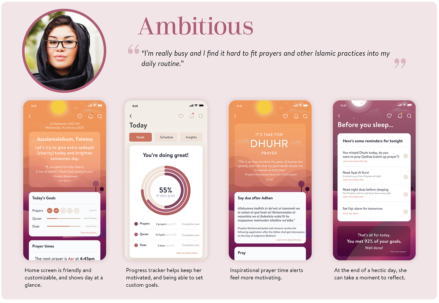
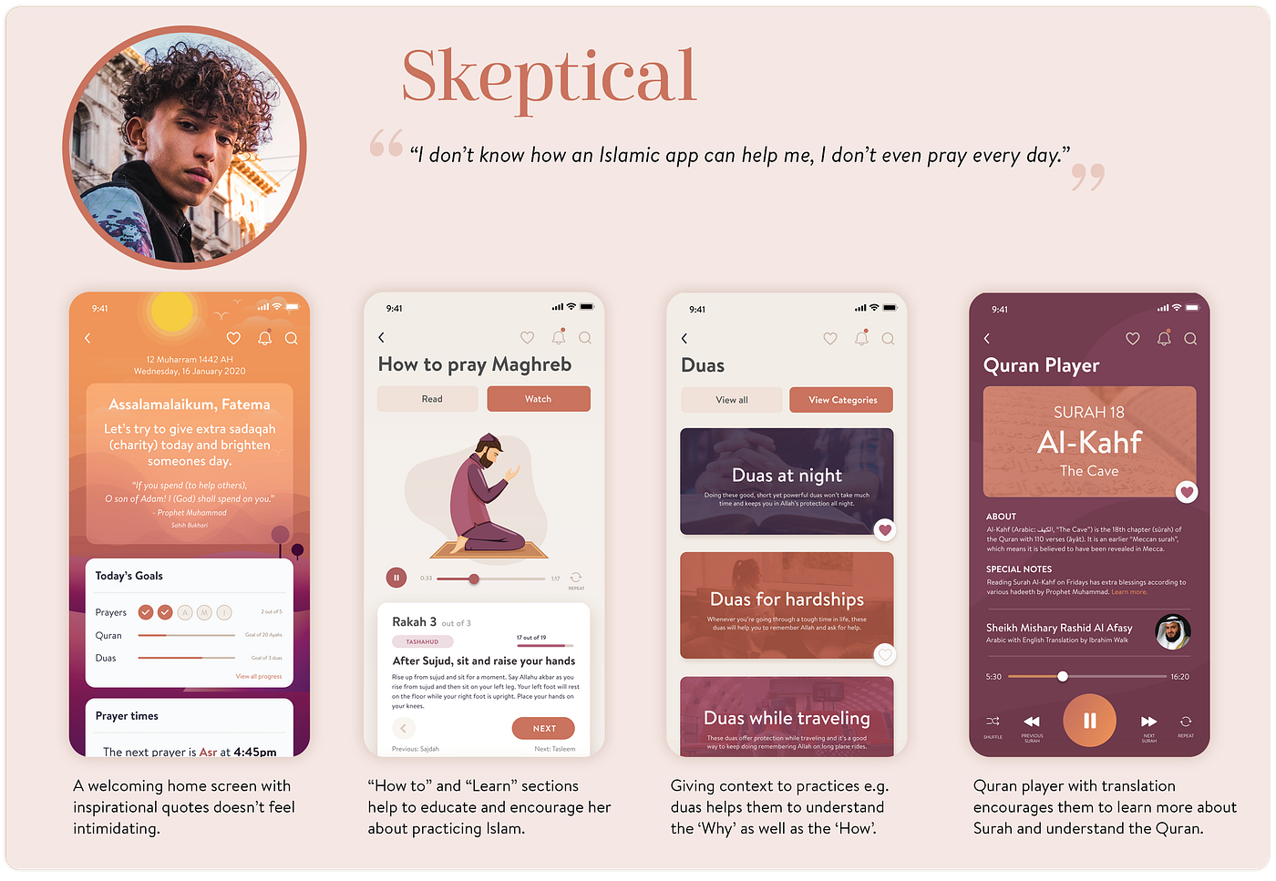
To better understand my users, I created Mindsets that help keep the user in mind throughout the design process and define problems to be solved. I ended up with 4 Mindsets as there would be a wide range of people my app could benefit.


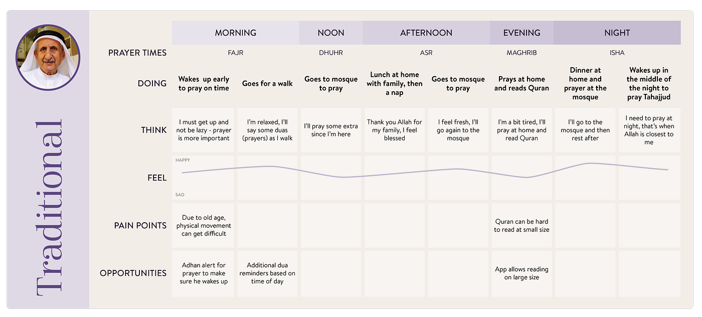
Journeys
The Mindsets helped to see the wide range of potential users for my app. To keep the app in the context of how it would fit into their day, I mapped out a typical day for each Mindset adding any pain points they experience in terms of practising their faith and in turn any opportunities for my app to solve their pain points.
Affinity Map
In order to check the main features the app should have, I wrote down my insights, pain points and ideas so far and grouped them using an affinity map.
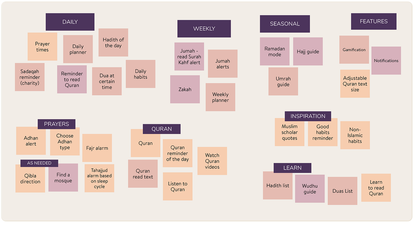
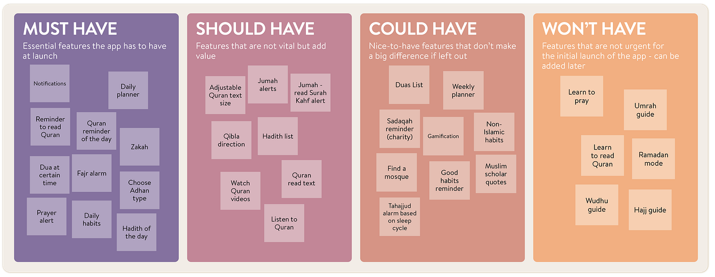
Prioritizing using MoSCoW
Through my Affinity Map, I could see clear patterns: which features would be essential, which were not useful but rarely used, and which would be used only seasonally. Using the MoSCoW (MoSCoW) Method, I then prioritised key features the app should have at launch.
3. Ideate
Time to come up with some ideas! Now that I had some clear features my app needed to be of value, I could see how these features would integrate, potential user flows when they use the app, and how to structure the app overall.
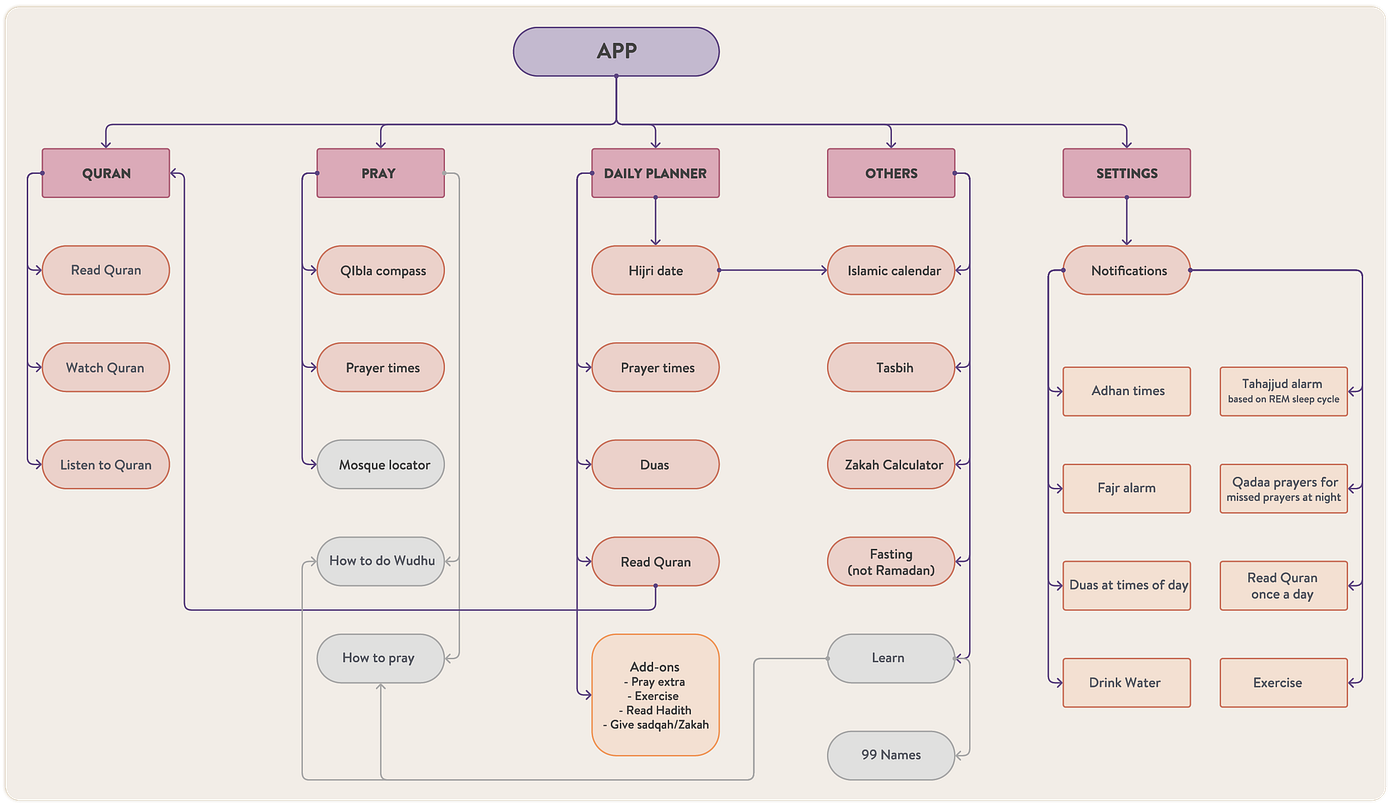
Information Architecture
I tried out potential flows for the app. Considering it’s a daily productivity app, priority was given to features that would be used daily (prayers being the main one). Some features are greyed out because they were too complex to include in the app’s initial launch, but will be added later.
Wireframes
I drew some quick wireframes for key screens, such as the Home page, the Tools page to show all the app’s features, and the Quran section. Drawing the wireframes also helped me change the flow from what I had initially thought, as I could see how the screens would relate to each other.
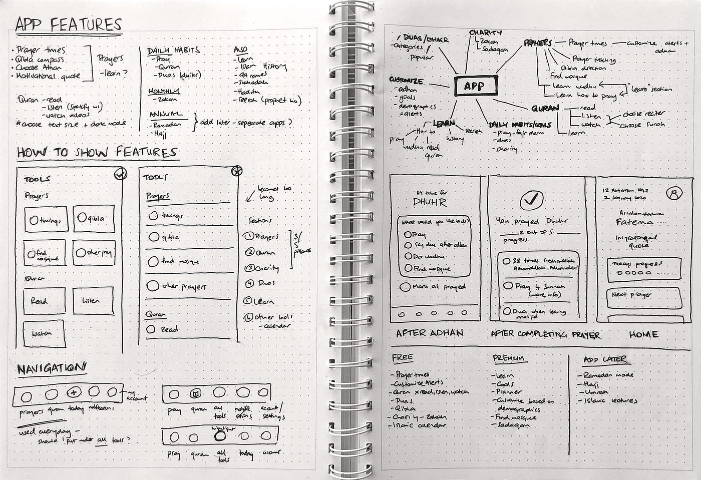
Once I knew which screens I needed to design, I looked at existing UI kits of fitness apps and productivity apps for inspiration.
4. Prototype
UI design
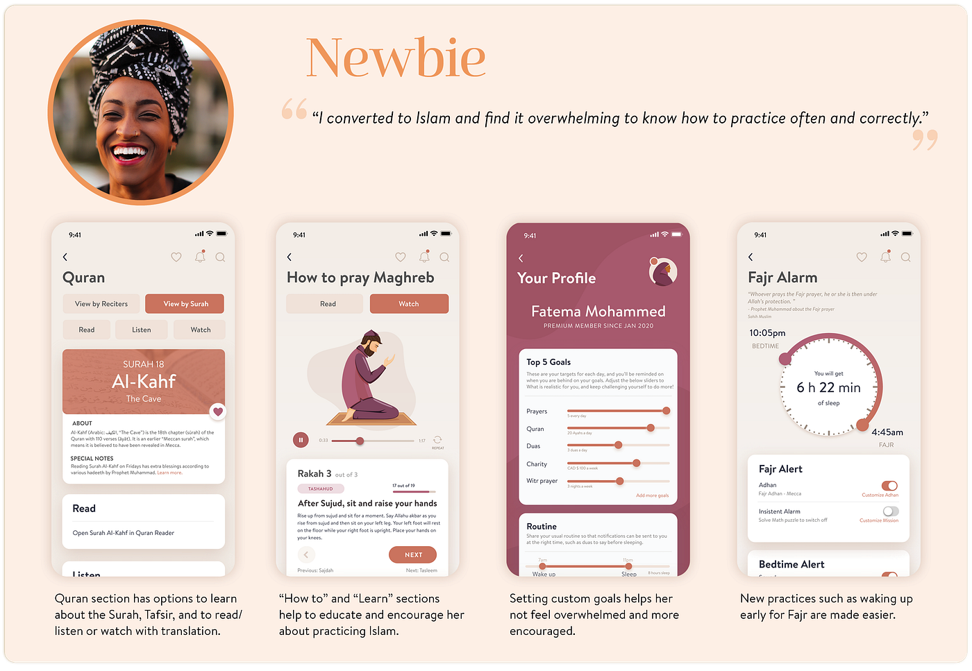
I wanted a soft design, keeping my current colour palette in mind. The design had to be simple enough for my Traditionalist mindset, who wanted an intuitive app, but also for the Ambitious mindset, who wanted integrated productivity features. There were also layers such as “Learn” sections for the Newbie and Sceptics.
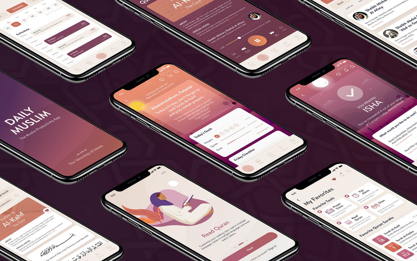
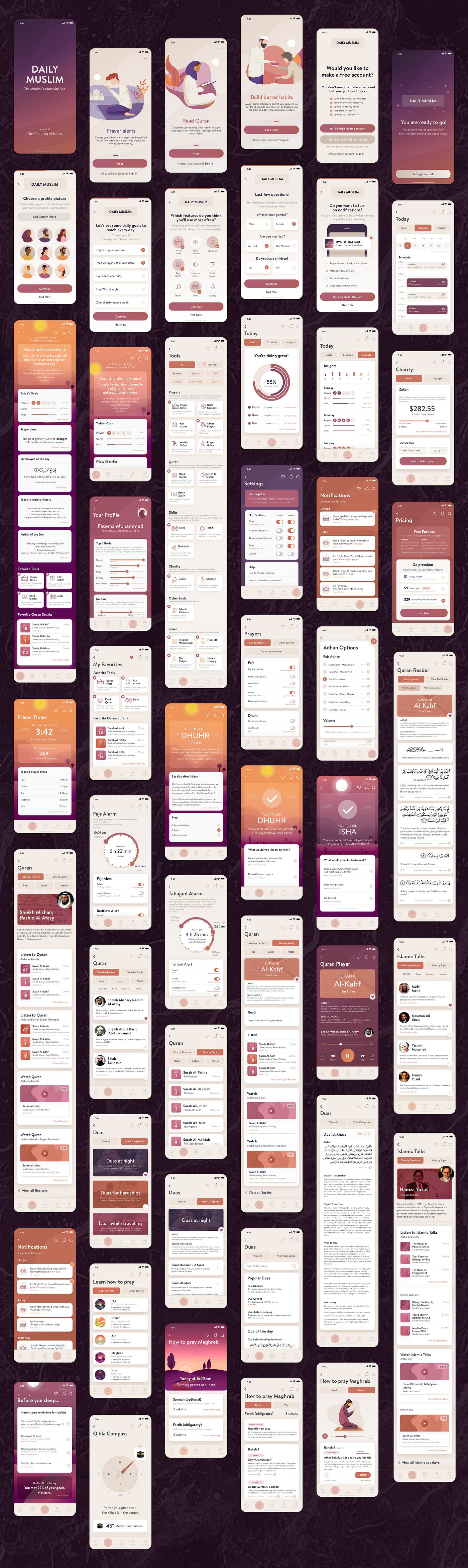
Clickable prototype
I made this interactive prototype in Adobe XD to understand how the app would flow. I felt it was important to include a Back button on each screen to help users avoid feeling overwhelmed by the large number of tools.
How does this app help Muslims?
Linking back to the Mindsets I outlined earlier, here are the key app features that would directly address users’ pain points.
Next Steps
Now that the app UI was ready, I handed it over to developers to create in Flutter and eventually launch on both the iOS and Android app stores.


